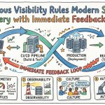
Introduction (100–200 words)
Design systems management tools are platforms that help teams create, document, govern, and ship reusable UI foundations—components, patterns, tokens, guidelines, and code—across products and platforms. In plain English: they keep design and engineering aligned so teams can build consistent interfaces faster, with less rework.
This matters even more in 2026+ because product orgs are juggling multi-brand experiences, cross-platform stacks (web + native), AI-assisted UI generation, and higher expectations around accessibility and compliance. Without strong system governance, “reusable” quickly turns into “duplicated.”
Real-world use cases include:
- Centralizing components and tokens across multiple apps
- Generating and distributing design tokens to web and native codebases
- Creating a single source of truth for UI documentation and usage guidelines
- Visual regression testing to prevent UI drift across releases
- Auditing and deprecating legacy components at scale
What buyers should evaluate:
- Token strategy support (variables, theming, multi-brand)
- Versioning, release workflows, and change approval
- Documentation quality (MDX/docs-as-code vs WYSIWYG)
- Design-tool sync (especially Figma libraries/variables)
- Code integration (Storybook, frameworks, package registries)
- Governance (roles, permissions, review gates)
- Search/discoverability and component metadata
- Testing/quality workflows (visual tests, accessibility checks)
- Security controls (SSO, RBAC, audit logs)
- Integration ecosystem and API maturity
Best for: product design teams, design system leads, front-end/platform engineering, and UX ops—especially in SaaS, fintech, enterprise, and multi-product companies (from fast-growing SMBs to global enterprises).
Not ideal for: very early-stage teams with a single product and minimal UI reuse, or teams that only need a basic style guide/wiki. In those cases, a lightweight documentation tool or a simple Storybook instance may be enough.
Key Trends in Design Systems Management Tools for 2026 and Beyond
- Token-first workflows become the default: design tokens (including semantic tokens) drive theming, dark mode, and multi-brand scale across web and native.
- AI-assisted governance: AI helps detect duplication, suggest component consolidation, flag inconsistent usage, and draft documentation—while humans remain the approvers.
- Docs-as-code and GitOps patterns expand: more teams want pull-requestable docs, review gates, and release notes tied to code changes.
- Figma variables + code sync matures: tools increasingly focus on turning Figma variables into production-ready token outputs, with validation and mapping layers.
- Continuous quality becomes table stakes: visual regression testing and component-level QA integrate into CI pipelines to prevent UI drift.
- Headless design system content: organizations want structured system data (components, guidelines, tokens) available via APIs for portals, internal tools, and AI assistants.
- Cross-platform output expectations: a single system must support web frameworks plus iOS/Android (and sometimes Flutter/React Native) with shared semantics.
- Stronger security posture requirements: SSO, RBAC, audit logs, and data residency options increasingly influence vendor selection.
- Multi-team federation: enterprises need federated ownership (multiple libraries, domains, brands) with centralized governance and discoverability.
- Pricing shifts toward usage and seats: more vendors combine seat-based pricing with usage limits (storage, builds, projects), impacting total cost at scale.
How We Selected These Tools (Methodology)
- Prioritized tools with strong market mindshare in design systems workflows (design, documentation, tokens, or component QA).
- Included solutions spanning design-first, engineering-first, and documentation-first approaches.
- Evaluated feature completeness for modern design system needs: tokens, components, docs, governance, and release workflows.
- Considered reliability/performance signals implied by typical production usage patterns (CI integration, collaboration, scale).
- Looked for security posture signals such as SSO/RBAC/audit log availability (where publicly described).
- Weighted tools with integration breadth (Figma, Git platforms, CI, issue tracking, component frameworks).
- Ensured a mix across SMB, mid-market, and enterprise use cases.
- Included open-source where it’s a credible default (especially for engineering-led teams).
- Avoided tools with unclear current viability for 2026+ if their status appears uncertain; when in doubt, we chose safer, widely used options.
Top 10 Design Systems Management Tools
#1 — Figma
Short description (2–3 lines): A design and collaboration platform widely used to build and maintain UI libraries, components, and variables. Best for orgs that want design-system management tightly integrated with day-to-day product design.
Key Features
- Component libraries with variants, properties, and constraints
- Variables for tokens (color, spacing, typography, etc.) and theming
- Reusable styles and consistent patterns across files and teams
- Real-time multiplayer collaboration and commenting
- Branching/merging workflows (availability varies by plan)
- Organization-level library publishing and permissions (varies by plan)
- Dev handoff features (inspect, measurements, assets) supporting design-to-code workflows
Pros
- Very high adoption: easier hiring, onboarding, and cross-team collaboration
- Strong component and variables model for token-first systems
- Excellent day-to-day usability for designers
Cons
- Not a full design system “platform” on its own (docs, governance, and code distribution may need other tools)
- Code-level workflows (testing, packages) require external systems
- Permissioning and governance depth can vary by plan and org maturity
Platforms / Deployment
- Web / Windows / macOS
- Cloud
Security & Compliance
- SSO/SAML, MFA, RBAC, audit logs: Varies by plan / Not publicly stated in a single universal baseline
- SOC 2 / ISO 27001 / HIPAA: Not publicly stated (verify with vendor for your plan/region)
Integrations & Ecosystem
Figma often sits at the center of design system workflows, with many downstream connections for tokens, docs, and code.
- Common connections with: Storybook workflows, token pipelines, and component documentation tools
- Issue tracking/work management connectors: Varies by plan/ecosystem
- API support for automation: Varies / Not publicly stated in full detail here
- Plugins ecosystem for tokens, linting, accessibility checks, and export tasks
- Design-to-code and handoff tooling via third-party ecosystem
Support & Community
Large global community, extensive learning content, and strong third-party ecosystem. Support tiers vary by plan; enterprise onboarding and admin support are plan-dependent.
#2 — Storybook
Short description (2–3 lines): An open-source UI component workshop for building, documenting, and testing components in isolation. Best for engineering-led design systems and teams shipping component libraries.
Key Features
- Component-driven development environment for UI libraries
- Auto-generated docs (framework-dependent) and interactive component demos
- Addons for controls, accessibility checks, and documentation enhancements
- Works across popular frameworks (ecosystem support varies by framework)
- Theming and story organization for component discovery
- Integration-friendly: can run in CI, static builds, and PR previews (via hosting)
- Strong foundation for visual testing when paired with specialized tools
Pros
- Developer-first and highly flexible for real-world component libraries
- Open-source: avoids vendor lock-in for the core experience
- Excellent for collaboration between front-end devs and QA
Cons
- Requires engineering time to set up, maintain, and scale
- Governance workflows (approvals, deprecations, ownership) are not “built-in”
- Docs quality depends on discipline and configuration
Platforms / Deployment
- Web (runs locally; outputs static site)
- Self-hosted (open-source) / Cloud hosting via your choice
Security & Compliance
- Security controls depend on where/how you host it (N/A as a standalone open-source tool)
- SSO/RBAC/audit logs: Depends on hosting platform and access layer
Integrations & Ecosystem
Storybook’s strength is its addon ecosystem and compatibility with CI and component workflows.
- Works alongside GitHub/GitLab/Bitbucket CI patterns (provider-agnostic)
- Integrates with testing frameworks (varies by stack)
- Static site hosting options for internal portals and previews
- Addon ecosystem for a11y, interactions, and docs
- Common pairing with visual regression services and design-token pipelines
Support & Community
Very strong open-source community, extensive docs, and many examples across frameworks. Commercial support: Varies / N/A (community-first).
#3 — Chromatic
Short description (2–3 lines): A cloud platform commonly used with Storybook for visual review, UI testing, and change management. Best for teams who want scalable visual regression and PR-based UI workflows.
Key Features
- Visual regression testing for UI components (Storybook-centered workflows)
- Review and approval flows for UI changes
- PR/build-based previews for faster design/dev feedback loops
- Baseline management and diffs for catching unintended UI changes
- Team collaboration around component-level QA
- CI integration patterns for gating merges on visual checks
- Workflow tooling for managing UI changes over time
Pros
- Reduces UI regressions and “pixel drift” in fast-moving codebases
- Fits naturally into PR-driven development and CI pipelines
- Helps teams scale UI quality without manual screenshot checking
Cons
- Best value typically requires disciplined Storybook usage
- Visual baselines require ongoing maintenance as systems evolve
- Not a full documentation/governance suite by itself
Platforms / Deployment
- Web
- Cloud
Security & Compliance
- SSO/SAML, RBAC, audit logs, encryption: Not publicly stated (verify with vendor)
- SOC 2 / ISO 27001: Not publicly stated
Integrations & Ecosystem
Chromatic is designed to sit in CI and code review loops around component changes.
- CI providers (conceptually): GitHub/GitLab/Bitbucket pipelines (varies by setup)
- Storybook-first integration model
- Notifications/workflow integrations: Varies / Not publicly stated
- Works with common front-end testing practices (stack-dependent)
- Supports component preview and review patterns for distributed teams
Support & Community
Good documentation and onboarding for Storybook-based teams. Community strength is often tied to the broader Storybook ecosystem; support tiers vary by plan.
#4 — zeroheight
Short description (2–3 lines): A documentation-focused design system platform used to publish guidelines, components, and standards in a structured, searchable site. Best for teams that want strong docs and cross-functional adoption.
Key Features
- Design system documentation with structured pages and navigation
- Component and pattern documentation with usage guidance
- Figma-centric workflows for keeping docs aligned with design sources
- Governance features such as contributor workflows (varies by plan)
- Search and discoverability for system content
- Versioning/release patterns for documentation changes (varies by setup)
- Collaboration features for design, engineering, and content stakeholders
Pros
- Excellent for driving adoption across product, design, and engineering
- Helps turn “tribal knowledge” into standardized guidance
- Strong fit for organizations with multiple teams needing a shared reference
Cons
- Not a replacement for engineering tooling (packages, CI, testing)
- Token management depth may require complementary tools
- Cost and structure may feel heavy for very small teams
Platforms / Deployment
- Web
- Cloud
Security & Compliance
- SSO/SAML, RBAC, audit logs: Varies / Not publicly stated
- SOC 2 / ISO 27001: Not publicly stated
Integrations & Ecosystem
zeroheight commonly complements design and engineering tooling rather than replacing it.
- Typical connections with design sources (e.g., Figma-based workflows)
- Content and documentation workflows with internal stakeholders
- API/export options: Varies / Not publicly stated
- Fits with Storybook and component library references (workflow-dependent)
- Works alongside issue tracking and comms tools (varies by plan/ecosystem)
Support & Community
Generally strong documentation and onboarding resources. Community is smaller than open-source tools but active among design system practitioners; support tiers vary by plan.
#5 — Supernova
Short description (2–3 lines): A design system platform oriented around turning design assets into living documentation and token/code outputs. Best for teams investing in tokens, multi-platform delivery, and structured system operations.
Key Features
- Centralized design system workspace for components, tokens, and guidelines
- Token management and outputs for multiple targets (varies by setup)
- Documentation site generation and structured content
- Versioning and release workflows for system updates
- Collaboration features for system maintainers and contributors
- Support for multi-brand/multi-theme approaches (workflow-dependent)
- Automation hooks for keeping system assets aligned across tools (varies)
Pros
- Strong fit for teams treating the design system as a product with releases
- Helps operationalize token distribution beyond a single platform
- Useful for teams balancing docs + outputs + governance
Cons
- Setup and taxonomy decisions take time to get right
- May overlap with existing doc platforms if you already have a strong docs stack
- Some advanced automation depends on your maturity and integration work
Platforms / Deployment
- Web
- Cloud
Security & Compliance
- SSO/SAML, RBAC, audit logs: Varies / Not publicly stated
- SOC 2 / ISO 27001: Not publicly stated
Integrations & Ecosystem
Supernova is typically used as an operations hub bridging design assets and development targets.
- Design-source connections (commonly Figma-centric workflows)
- Token export pipelines to code repositories (workflow-dependent)
- CI automation possibilities: Varies / Not publicly stated
- Documentation publishing and internal portal patterns
- Extensibility via APIs/automation: Varies / Not publicly stated
Support & Community
Documentation is generally solid; support tiers vary by plan. Community is active among design systems teams, though smaller than mass-market design tools.
#6 — Frontify
Short description (2–3 lines): A brand and design system management platform combining guidelines, asset management, and collaborative review. Best for organizations that need brand governance and design system documentation under one roof.
Key Features
- Brand guidelines and design system documentation in a unified platform
- Asset management capabilities (DAM-like workflows vary by configuration)
- Collaboration and approvals for brand/system content
- Modular page building for guidelines, components, and patterns
- Governance features for distributed teams (roles/workflows vary)
- Multi-brand support (workflow-dependent)
- Publishing controls for internal and external audiences (varies by plan)
Pros
- Strong for brand consistency across marketing + product UI
- Helps centralize assets, guidance, and approvals
- Good fit for organizations with many stakeholders and content contributors
Cons
- Engineering-centric needs (component testing, CI) still require separate tooling
- Can be more platform-heavy than teams purely focused on code components
- Implementation quality depends on information architecture and ownership
Platforms / Deployment
- Web
- Cloud
Security & Compliance
- SSO/SAML, RBAC, audit logs: Varies / Not publicly stated
- SOC 2 / ISO 27001: Not publicly stated
Integrations & Ecosystem
Frontify often integrates into broader brand, content, and product workflows.
- Typical integrations with design tools and asset workflows (varies)
- Collaboration patterns with review/approval stakeholders
- API/connectors: Varies / Not publicly stated
- Works alongside documentation and component library tooling
- Workflow integrations with project management tools: Varies / Not publicly stated
Support & Community
Usually strong vendor-led onboarding and support for mid-market/enterprise; community is more brand-ops oriented than open-source ecosystems. Support tiers vary by plan.
#7 — Knapsack
Short description (2–3 lines): A design system platform focused on documentation, governance, and connecting design and code. Best for teams that want a managed system portal with structured component documentation.
Key Features
- Design system documentation site with structured navigation
- Component cataloging and usage guidelines tied to code/design references
- Contribution workflows for maintaining system content
- Versioning and release communications (workflow-dependent)
- Search and metadata for discoverability
- Support for multiple libraries/products (org-dependent)
- Collaboration features for cross-functional design system teams
Pros
- Useful for formalizing system governance and documentation standards
- Helps teams scale adoption across multiple product squads
- Encourages consistent component usage through centralized guidance
Cons
- Not a replacement for code hosting, package management, or CI
- Requires ongoing maintenance and editorial ownership
- Fit depends on how you want to balance docs-as-code vs platform docs
Platforms / Deployment
- Web
- Cloud
Security & Compliance
- SSO/SAML, RBAC, audit logs: Varies / Not publicly stated
- SOC 2 / ISO 27001: Not publicly stated
Integrations & Ecosystem
Knapsack typically sits between design sources and engineering artifacts.
- Common workflows with design tools and component libraries
- Connections to repositories and documentation references (varies)
- API/export capabilities: Varies / Not publicly stated
- Can complement Storybook instances as the interactive component layer
- Works with internal portals/knowledge bases via embedding or references (varies)
Support & Community
Vendor-led support is typically a major part of adoption; documentation is available. Community is smaller than open-source tools; support tiers vary by plan.
#8 — Specify
Short description (2–3 lines): A token and design data management tool focused on turning design decisions into structured outputs for developers. Best for teams that want a dedicated layer for token pipelines and multi-target distribution.
Key Features
- Central management for design tokens and design data (workflow-dependent)
- Validation and normalization to reduce inconsistent token definitions
- Outputs to developer-friendly formats (based on your targets)
- Collaboration workflows for token changes and reviews (varies)
- Bridges design sources to code repositories (integration-dependent)
- Supports scalable theming and semantic token approaches (maturity-dependent)
- Helps reduce manual token updates and copy/paste handoffs
Pros
- Strong fit for token-first design systems and multi-platform theming
- Helps engineering teams consume consistent token outputs
- Encourages better governance of “source of truth” design decisions
Cons
- Typically complements—not replaces—docs platforms and component workshops
- Requires upfront token taxonomy and naming discipline
- Integration work may be needed to match your build and release practices
Platforms / Deployment
- Web
- Cloud
Security & Compliance
- SSO/SAML, RBAC, audit logs: Varies / Not publicly stated
- SOC 2 / ISO 27001: Not publicly stated
Integrations & Ecosystem
Specify is often used as the “token pipeline” layer in a modern system stack.
- Design-source integrations (commonly Figma-centered workflows)
- Code repository outputs (Git-based workflows are typical)
- Build/CI automation patterns (varies by org)
- Works alongside Storybook and documentation portals
- API/automation: Varies / Not publicly stated
Support & Community
Documentation is generally geared toward implementation and workflows. Community is growing among token-focused teams; support tiers vary by plan.
#9 — Backlight
Short description (2–3 lines): A cloud platform for building and documenting design systems with a developer-centric approach (often including component development and documentation workflows). Best for teams that want an integrated environment for system delivery.
Key Features
- Workspace for design system development and documentation
- Component-oriented workflows and environment setup (stack-dependent)
- Documentation and examples tied closely to implementation
- Collaboration features for distributed system teams
- Versioning and preview workflows (varies)
- Support for system maintenance and iteration over time
- Designed to reduce friction between building components and documenting them
Pros
- Good for teams who want docs and implementation closer together
- Helps reduce the “docs drift” between guidelines and shipped components
- Useful for design system teams acting like an internal platform team
Cons
- Fit depends on your preferred frameworks and tooling patterns
- May require workflow changes vs a pure Git + Storybook approach
- Some orgs may prefer self-hosted control and simpler primitives
Platforms / Deployment
- Web
- Cloud
Security & Compliance
- SSO/SAML, RBAC, audit logs: Varies / Not publicly stated
- SOC 2 / ISO 27001: Not publicly stated
Integrations & Ecosystem
Backlight is typically used as part of a broader engineering toolchain.
- Works with common Git-based workflows (integration details vary)
- Can complement or replace parts of a Storybook/docs setup (org-dependent)
- CI and preview patterns: Varies / Not publicly stated
- Supports collaboration around component lifecycle
- Extensibility via integrations/APIs: Varies / Not publicly stated
Support & Community
Vendor documentation and onboarding resources are important here; community is smaller than Storybook but active among design system practitioners. Support tiers vary by plan.
#10 — UXPin Merge
Short description (2–3 lines): A design tool workflow that brings coded components into the design environment to reduce design-to-dev mismatch. Best for teams that want designers working with real components for higher fidelity and consistency.
Key Features
- Use coded components inside design workflows (implementation-dependent)
- Reduces “design mock vs real UI” discrepancies
- Aligns design decisions with component APIs and constraints
- Supports system consistency by reusing production components
- Enables more reliable handoff for complex UI patterns
- Improves collaboration between designers and engineers around components
- Helps scale design consistency when components are the source of truth
Pros
- Strong for reducing rework caused by unrealistic mockups
- Encourages design within system constraints (a common enterprise need)
- Helpful for complex products with rich interaction patterns
Cons
- Setup requires engineering effort and component readiness
- Not primarily a documentation portal or token pipeline tool
- Workflow change for designers used to fully freeform design tools
Platforms / Deployment
- Web / Windows / macOS (varies by product configuration)
- Cloud (deployment varies)
Security & Compliance
- SSO/SAML, RBAC, audit logs: Varies / Not publicly stated
- SOC 2 / ISO 27001: Not publicly stated
Integrations & Ecosystem
UXPin Merge workflows depend heavily on your component stack and how you package/share components.
- Works with component libraries and internal registries (implementation-dependent)
- Typical Git-based workflows for source control (varies)
- Fits alongside Storybook for component exploration (workflow-dependent)
- Collaboration with design system governance processes (org-dependent)
- Automation/APIs: Varies / Not publicly stated
Support & Community
Documentation and professional services can be important for implementation; support tiers vary by plan. Community is smaller than mainstream design tools but active in design ops/system circles.
Comparison Table (Top 10)
| Tool Name | Best For | Platform(s) Supported | Deployment (Cloud/Self-hosted/Hybrid) | Standout Feature | Public Rating |
|---|---|---|---|---|---|
| Figma | Design-led system creation and library management | Web, Windows, macOS | Cloud | Variables + component libraries at massive scale | N/A |
| Storybook | Engineering-led component development and docs | Web | Self-hosted | Component workshop + addon ecosystem | N/A |
| Chromatic | Visual regression + UI review workflows | Web | Cloud | PR-based visual diffs and approvals | N/A |
| zeroheight | Design system documentation and adoption | Web | Cloud | Structured docs optimized for cross-functional teams | N/A |
| Supernova | System ops: tokens + docs + releases | Web | Cloud | Token-to-output and system release workflows | N/A |
| Frontify | Brand + design system governance | Web | Cloud | Brand governance + guidelines + assets in one place | N/A |
| Knapsack | Managed design system portal | Web | Cloud | Governance-oriented documentation and cataloging | N/A |
| Specify | Token pipelines and design data outputs | Web | Cloud | Dedicated token management and distribution layer | N/A |
| Backlight | Integrated system build + docs environment | Web | Cloud | Implementation-close documentation workflows | N/A |
| UXPin Merge | Designing with real coded components | Web, Windows, macOS (varies) | Cloud | Designers use production components in design | N/A |
Evaluation & Scoring of Design Systems Management Tools
Scoring model (1–10 per criterion) with weighted total (0–10):
Weights:
- Core features – 25%
- Ease of use – 15%
- Integrations & ecosystem – 15%
- Security & compliance – 10%
- Performance & reliability – 10%
- Support & community – 10%
- Price / value – 15%
| Tool Name | Core (25%) | Ease (15%) | Integrations (15%) | Security (10%) | Performance (10%) | Support (10%) | Value (15%) | Weighted Total (0–10) |
|---|---|---|---|---|---|---|---|---|
| Figma | 9 | 9 | 8 | 7 | 8 | 7 | 8 | 8.20 |
| Storybook | 8 | 6 | 8 | 6 | 7 | 8 | 9 | 7.55 |
| Chromatic | 7 | 7 | 7 | 6 | 8 | 7 | 7 | 7.00 |
| zeroheight | 8 | 8 | 7 | 7 | 7 | 7 | 7 | 7.40 |
| Supernova | 8 | 7 | 7 | 6 | 7 | 7 | 7 | 7.15 |
| Frontify | 8 | 7 | 8 | 7 | 7 | 7 | 6 | 7.25 |
| Knapsack | 8 | 6 | 8 | 7 | 7 | 7 | 6 | 7.10 |
| Specify | 7 | 7 | 7 | 6 | 7 | 7 | 8 | 7.05 |
| Backlight | 7 | 6 | 7 | 6 | 7 | 6 | 7 | 6.65 |
| UXPin Merge | 8 | 6 | 7 | 7 | 7 | 6 | 6 | 6.85 |
How to interpret these scores:
- Scores are comparative, not absolute—meant to help shortlist tools by strengths.
- A lower “Ease” score doesn’t mean a tool is bad; it may be more configurable or engineering-heavy.
- “Security” reflects commonly expected enterprise controls, but many specifics are plan-dependent and should be verified.
- Your best choice often comes from the right combination (e.g., Figma + Storybook + token tooling), not one platform alone.
Which Design Systems Management Tool Is Right for You?
Solo / Freelancer
If you’re a solo designer/developer, prioritize speed and simplicity over heavy governance:
- Start with Figma for components and variables.
- Add Storybook only if you’re shipping a reusable component library and want isolated development.
- Consider a lightweight documentation approach first; full platforms like Frontify/Knapsack may be overkill.
SMB
SMBs often need consistency across a few squads without enterprise bureaucracy:
- Figma + Storybook is a strong baseline for design + code.
- Add Chromatic if UI regressions are hurting you or you ship frequently.
- Use zeroheight if adoption and shared guidelines are the main gap (especially cross-functional alignment).
Mid-Market
Mid-market orgs typically hit scale challenges: multiple products, teams, and release trains:
- Figma remains the design hub; pair with zeroheight or Knapsack for structured docs and governance.
- If tokens and theming are central (multi-brand, white-label), consider Specify or Supernova as a dedicated token/system ops layer.
- Add Chromatic to operationalize component QA in CI.
Enterprise
Enterprises usually need federation, governance, auditability, and stakeholder alignment across many teams:
- Use Frontify when brand governance + guidelines + approvals matter across product and marketing.
- Use Knapsack or zeroheight for a centralized system portal and structured documentation.
- Use Storybook + Chromatic for engineering-grade component QA and release confidence.
- Add Specify or Supernova for token pipelines and multi-platform distribution—especially with multi-brand theming.
Budget vs Premium
- Budget-leaning stack: Figma + Storybook (self-hosted) + your existing wiki. Add Chromatic only if visual regression becomes necessary.
- Premium/managed stack: zeroheight/Knapsack/Frontify + token tooling (Specify/Supernova) + Chromatic for UI QA. This reduces internal maintenance but increases vendor spend.
Feature Depth vs Ease of Use
- If you want fast adoption: prioritize Figma + zeroheight (docs) and keep workflows simple.
- If you want deep engineering rigor: Storybook + CI + visual tests (Chromatic) + a token pipeline (Specify/Supernova).
- If you need design fidelity from real components: evaluate UXPin Merge (especially for complex UI).
Integrations & Scalability
- If your org is Git-centric and PR-driven, ensure your toolchain supports:
- PR previews
- CI gating
- Clear versioning and changelogs
- Storybook-centered workflows scale well when paired with strong CI practices and a stable component API strategy.
Security & Compliance Needs
- If you require SSO, RBAC, audit logs, and possibly data residency, validate:
- Which plan includes which controls
- How exports/backups work
- How access is managed for contractors and vendors
- For open-source (Storybook), security is primarily about your hosting and access layer.
Frequently Asked Questions (FAQs)
What’s the difference between a design system tool and a UI component library?
A component library is typically the code (packages/components). A design system tool helps manage the whole system: documentation, tokens, governance, adoption, and quality workflows.
Do I need a dedicated design system management platform if I already use Figma?
Not always. Figma covers design libraries well, but many teams add a platform when they need stronger documentation, governance, versioning, or token/code distribution beyond what Figma provides.
How long does it take to implement a design system management tool?
Varies widely. A basic setup can take days, but a well-governed enterprise system (taxonomy, tokens, contribution model, releases) often takes weeks to months to operationalize.
What pricing models are typical in this category?
Most tools use seat-based pricing, often with plan tiers. Some add usage dimensions like storage, projects, build minutes, or number of sites. Exact pricing: Varies / Not publicly stated here.
What are the most common mistakes teams make when adopting these tools?
Common mistakes include: no clear ownership, unclear component/tokens taxonomy, treating docs as a one-time project, and not aligning release workflows with engineering realities.
How do I keep documentation from going stale?
Tie docs updates to the same workflow as component changes: PR templates, review gates, release notes, and a clear “definition of done.” Tools help, but process matters more.
Are AI features reliable for design systems management?
AI can help with search, suggestions, and drafting docs, but it should not be the final authority. The safest approach is AI-assisted + human-approved governance.
What security features should I require for enterprise use?
At minimum: SSO/SAML, RBAC, MFA support, and audit logs. If your organization needs formal compliance attestations, confirm them directly with the vendor (many details are plan-dependent).
Can these tools support multi-brand or white-label products?
Yes—usually through semantic tokens, theming models, and structured libraries. Your success depends on a clean token architecture and disciplined component APIs, not only the tool.
How hard is it to switch design systems tools later?
Switching can be moderate to painful depending on how much content lives in the platform. To reduce risk, keep core assets portable: tokens in version control, components as packages, and docs in exportable formats when possible.
What’s a practical “minimum stack” for a modern design system?
A common minimum is: Figma (design + variables) + Storybook (component workshop/docs) + a basic doc site/wiki. Add Chromatic for visual testing and Specify/Supernova if token distribution becomes complex.
Conclusion
Design systems management tools are no longer just “nice-to-have documentation.” In 2026+, they’re operational platforms for scaling UI consistency, shipping faster, and reducing design-to-dev drift—especially as token-driven theming, cross-platform delivery, and AI-assisted workflows become standard.
The best choice depends on your context:
- Design-led teams often start with Figma and add documentation (zeroheight/Knapsack/Frontify).
- Engineering-led teams often anchor on Storybook and add visual QA (Chromatic).
- Organizations scaling theming and multi-platform output benefit from token pipeline tooling (Specify/Supernova).
Next step: shortlist 2–3 tools that match your operating model, run a time-boxed pilot, and validate integrations, permissions/security needs, and release workflows before committing.


Leave a Reply
You must be logged in to post a comment.